
在网页设计的江湖里,三栏布局就像一场和谐的三人舞:左边道兄导航带路,从不迷途;中间内容君唱主角,精彩纷呈;右边小弟广告悄悄说,新鲜事儿瞧一瞧。他们各司其职,又相互成就,在代码的舞台上默契共舞,为用户演绎一出出信息丰富的视觉盛宴,那么怎么答三栏布局,才会让面试官们全体起立呢?
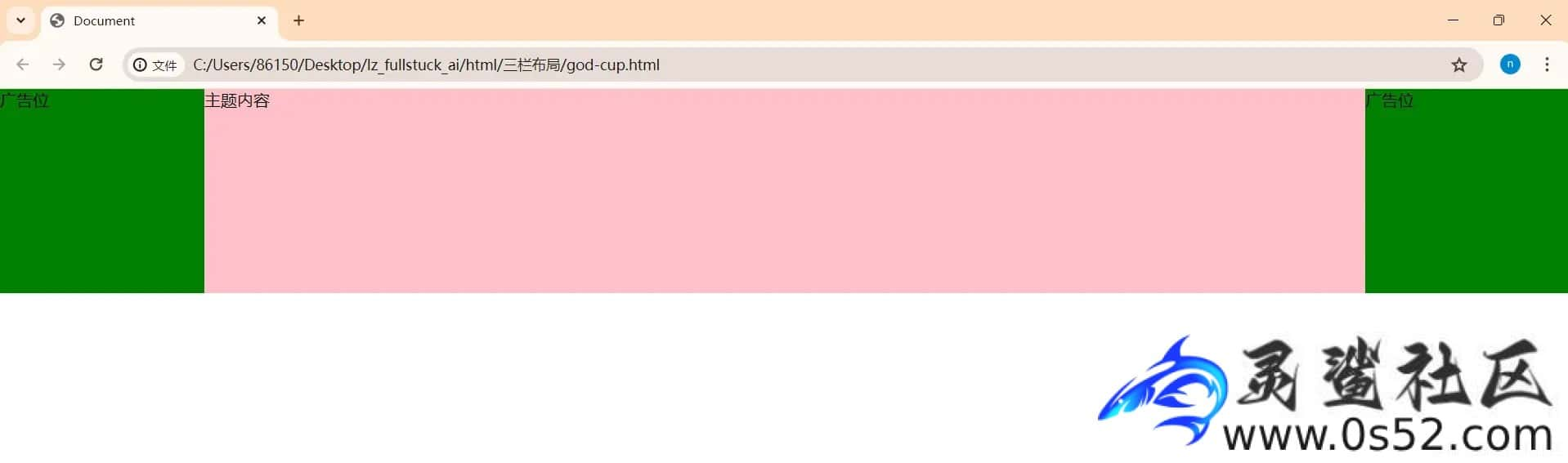
1.圣杯布局
xml文章源自灵鲨社区-https://www.0s52.com/bcjc/javascriptjc/15206.html
<!DOCTYPE html>
<html lang="en">

<head>
  <meta charset="UTF-8">
  <meta name="viewport" content="width=device-width, initial-scale=1.0">
  <title>Document</title>
  <style>
    * {
      margin: 0;
      padding: 0;
    }

    .page {
      height: 200px;
      padding: 0 200px;
    }

    .left,
    .right {
      height: 200px;
      width: 200px;
      background-color: green;
    }

    .page div {
      float: left
    }

    .content {
      width: 100%;
      height: 200px;
      background-color: pink;
    }

    .left {
      margin-left: -200px;
      position: relative;
      left: -100%;
    }

    .right {
      margin-left: -200px;
      position: relative;
      right: -200px;
    }
  </style>
</head>

<body>
  <div class="page">
    <div class="content">主题内容</div>
    <div class="left">广告位</div>
    <div class="right">广告位</div>
  </div>
</body>

</html>
 文章源自灵鲨社区-https://www.0s52.com/bcjc/javascriptjc/15206.html
圣杯布局的核心是,既满足三栏布局的要求,又可以让中间的主体内容部分优先加载。我们讲解一下其中的重点部分。文章源自灵鲨社区-https://www.0s52.com/bcjc/javascriptjc/15206.html
- 首先给出html部分的基础样式。
- 对大盒子设置一个外边距200px。
- 把三个子元素均设置为浮动。
- left采用相对定位,首先距离左边-200px,然后相对自己往左移父容器的100%。
- right采用相对定位,首先距离左边-200px,然后相对自己右移200px。
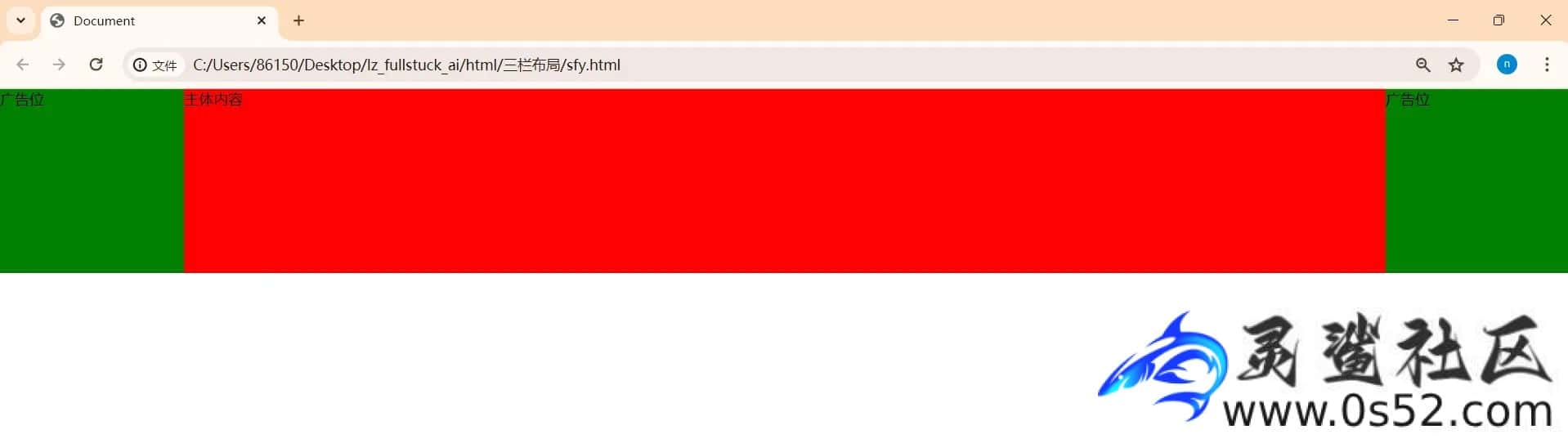
2.双飞翼布局
双飞翼布局起源于淘宝UED(User Experience Design,用户体验设计团队),是针对Web页面设计的一种三栏布局技术。该布局方式旨在解决两边固定宽度,中间自适应宽度的需求,同时确保中间内容区域优先加载渲染。双飞翼布局的命名形象地比喻为一只鸟,其中“主体内容”如同鸟的身体,位于HTML结构的最前方,而“侧边栏”(左右两栏)如同鸟的双翼,通过特定的CSS技巧调整位置紧随其后。这种方法是对圣杯布局的一种改进,优化了代码结构和渲染流程,提高了页面加载效率。文章源自灵鲨社区-https://www.0s52.com/bcjc/javascriptjc/15206.html
xml文章源自灵鲨社区-https://www.0s52.com/bcjc/javascriptjc/15206.html
<!DOCTYPE html>
<html lang="en">

<head>
  <meta charset="UTF-8">
  <meta name="viewport" content="width=device-width, initial-scale=1.0">
  <title>Document</title>
  <style>
    * {
      margin: 0;
      padding: 0;
    }

    .page {
      height: 200px;
    }

    .left,
    .right {
      height: 200px;
      width: 200px;
      background-color: green;
    }

    .page>div {
      float: left;
    }

    .content {
      height: 200px;
      background-color: red;
      width: 100%;
    }

    .inner {
      margin: 0 200px;
      height: 100%;
    }

    .left {
      margin-left: -100%;
    }

    .right {
      margin-left: -200px;
    }
  </style>
</head>

<body>
  <div class="page">
    <div class="content">
      <div class="inner">主体内容</div>
    </div>
    <div class="left">广告位</div>
    <div class="right">广告位</div>
  </div>
</body>

</html>
 文章源自灵鲨社区-https://www.0s52.com/bcjc/javascriptjc/15206.html
我们也来讲解一下其中的重点内容。文章源自灵鲨社区-https://www.0s52.com/bcjc/javascriptjc/15206.html
- 把主体内容放在content里面。
- page下面的一级div设置为float。
- 对主体内容设置距离两边200px。
- left只要往左移父容器的宽度即可。
- right往左移自身宽度即可。
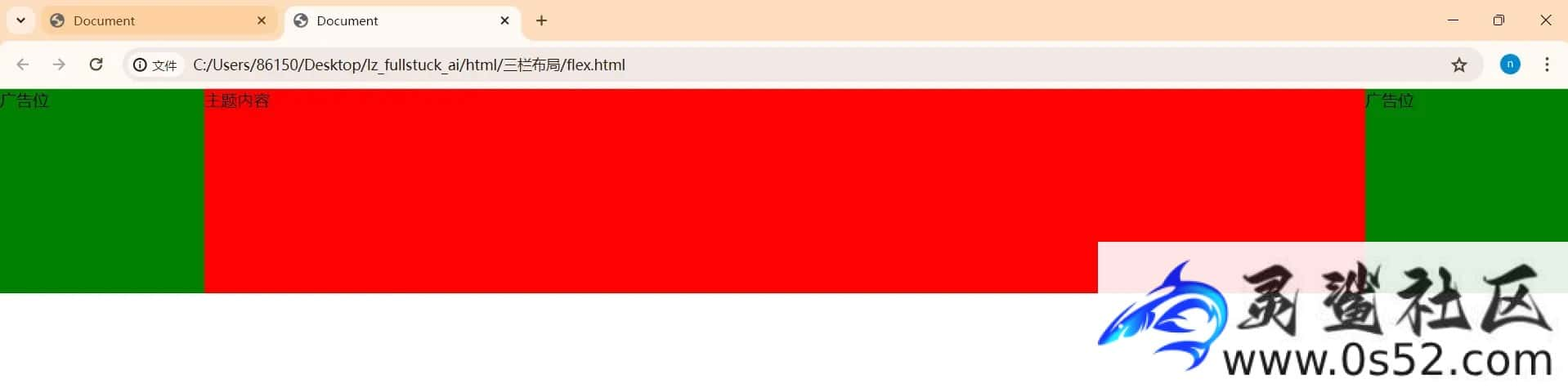
3.flex布局
这是最优雅的方式文章源自灵鲨社区-https://www.0s52.com/bcjc/javascriptjc/15206.html
xml文章源自灵鲨社区-https://www.0s52.com/bcjc/javascriptjc/15206.html
<!DOCTYPE html>
<html lang="en">

<head>
  <meta charset="UTF-8">
  <meta name="viewport" content="width=device-width, initial-scale=1.0">
  <title>Document</title>
  <style>
    * {
      margin: 0;
      padding: 0;
    }

    .page {
      height: 200px;
      display: flex;
    }

    .left,
    .right {
      background-color: green;
      width: 200px;
    }

    .content {
      background-color: red;
      flex: 1;
      order: 1;
    }

    .left {
      order: 0;
    }

    .right {
      order: 2;
    }
  </style>
</head>

<body>
  <div class="page">
    <div class="content">主题内容</div>
    <div class="left">广告位</div>
    <div class="right">广告位</div>
  </div>
</body>

</html>
 文章源自灵鲨社区-https://www.0s52.com/bcjc/javascriptjc/15206.html
我们看看主要内容
- 主体内容依然放在首位。
- 对父容器设置为弹性容器。
- 让中间的内容占有剩余的全部宽度。
- 利用顺序order属性改变页面显示顺序(不影响渲染顺序)。
怎么样,是不是既高效又优雅呢?
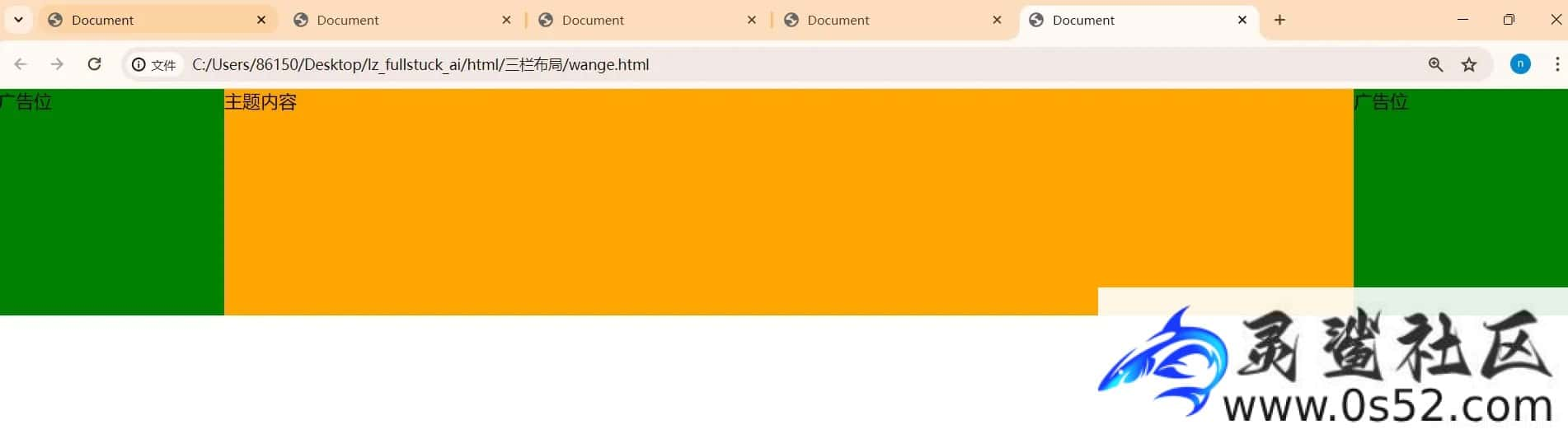
4. table布局
xml
<!DOCTYPE html>
<html lang="en">

<head>
  <meta charset="UTF-8">
  <meta name="viewport" content="width=device-width, initial-scale=1.0">
  <title>Document</title>
  <style>
    * {
      margin: 0;
      padding: 0;
    }

    .page {
      width: 100vw;
      height: 200px;
      display: table;
      table-layout: fixed;
    }

    .page>div {
      display: table-cell;
    }

    .left,
    .right {
      background-color: green;
      width: 200px;
      height: 200px;
    }

    .content {
      width: 100%;
      height: 200px;
      background-color: orange;
    }
  </style>
</head>

<body>
  <div class="page">
    <div class="left">广告位</div>
    <div class="content">主题内容</div>
    <div class="right">广告位</div>
  </div>
</body>

</html>
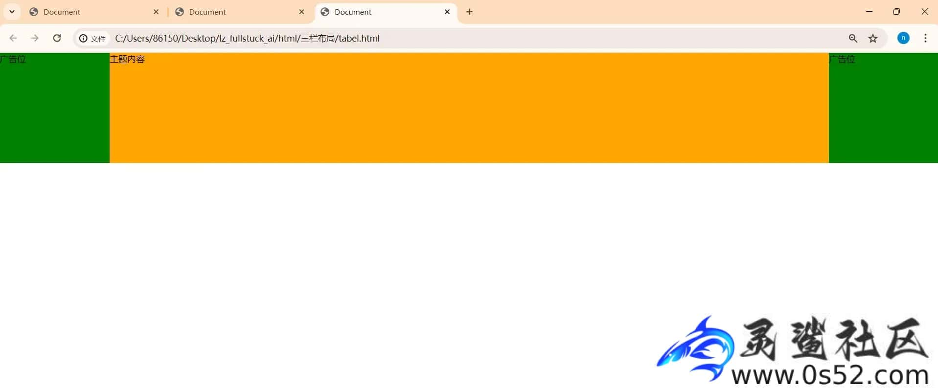
这个布局方式虽然不能让主体内容优先被加载,但是仍然满足三栏布局的要求。
- 对大容器设置为tabel属性,并且让表格列宽由我们设定而不是基于单元格内容。
- 把子级一级div设置为表格单元格。
- 中心内容占据剩余100%宽。
5.网格布局
这个布局方式和表格类似,虽然不能让主体内容优先被加载,但是仍然满足三栏布局的要求。
xml
<!DOCTYPE html>
<html lang="en">

<head>
  <meta charset="UTF-8">
  <meta name="viewport" content="width=device-width, initial-scale=1.0">
  <title>Document</title>
  <style>
    * {
      margin: 0;
      padding: 0;
    }

    .page {
      width: 100vw;
      height: 200px;
      display: grid;
      grid-template-columns: 200px auto 200px;
    }


    .left,
    .right {
      background-color: green;
      height: 200px;
    }

    .content {
      height: 200px;
      background-color: orange;
    }
  </style>
</head>

<body>
  <div class="page">
    <div class="left">广告位</div>
    <div class="content">主题内容</div>
    <div class="right">广告位</div>
  </div>
</body>

</html>
网格布局也非常优雅,除了不能优先渲染,剩余的尽是优雅。
我们只需要对大盒子设置为网格,然后利用grid-template-columns: 200px auto 200px属性设置三个子元素的宽就可以了,怎么样,是不是很优雅呢?
6. 小结
三栏布局是一种网页设计布局方式,它将页面横向分为三个等宽或不等宽的垂直区域。这种布局可以让内容更加有序,常见的是左边是导航栏,中间是主要内容区,右边是边栏(如广告、最新动态等)。通过CSS的浮动、定位或Flexbox、Grid布局等技术实现,适应不同屏幕尺寸,提升用户体验。
评论