
看新闻说是广州已经是52天中只有7天没下雨,我看现在已经是60多天了吧,真是谢谢了?。 听说山东有的地方却很久没下雨,村民都开始"求雨"了,老天爷啊,快把广东的雨分点过去吧,别闹了,人真发霉了?。文章源自灵鲨社区-https://www.0s52.com/bcjc/javascriptjc/15770.html
上篇文章小编说从玩了两年多的游戏退游,倔友问是什么游戏,这里放个游戏截图,看看有没有同道中人?。文章源自灵鲨社区-https://www.0s52.com/bcjc/javascriptjc/15770.html
 文章源自灵鲨社区-https://www.0s52.com/bcjc/javascriptjc/15770.html
之所以舍不得队友,是因为两年时光里,从开区到现在队伍一直很稳定,游戏中有的队伍已经重组了无数次,而我们队伍一直都在,队友们都很配合与团结,真的很快乐。文章源自灵鲨社区-https://www.0s52.com/bcjc/javascriptjc/15770.html
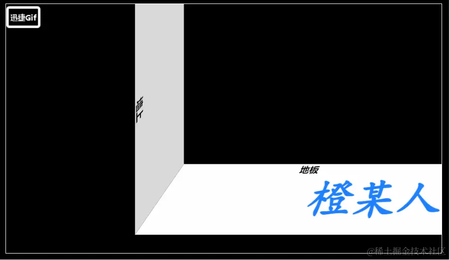
好了,又唠叨了一下,回到正题,本文将分享一个地上投影灯的移动效果,具体效果如下,请诸君按需食用。文章源自灵鲨社区-https://www.0s52.com/bcjc/javascriptjc/15770.html
 文章源自灵鲨社区-https://www.0s52.com/bcjc/javascriptjc/15770.html
原理
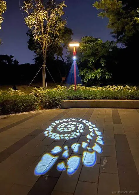
相信各位彦祖亦菲日常生活都有见过这种地上的投影灯:文章源自灵鲨社区-https://www.0s52.com/bcjc/javascriptjc/15770.html
 文章源自灵鲨社区-https://www.0s52.com/bcjc/javascriptjc/15770.html
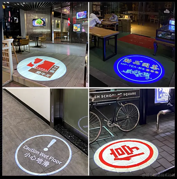
它用来作为预警提示或者打广告效果还是不错的,但是呢,我们今天要来研究的是,这种投影效果的移动过程中,遇到上墙壁或者楼梯时,这个移动过程的效果要如何来实现呢?文章源自灵鲨社区-https://www.0s52.com/bcjc/javascriptjc/15770.html
你可以想象这个移动效果吗??文章源自灵鲨社区-https://www.0s52.com/bcjc/javascriptjc/15770.html
没见过或者想象不出来可以参考开头的动图,咱们大概就是要做这么一个效果耍耍。
那么,要如何做呢❓分析一下原理❓老规矩,且看图:
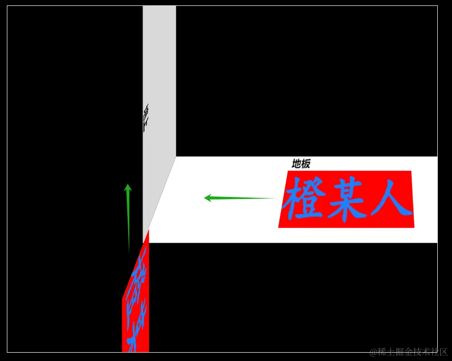
一图胜千言,明白了撒?
原理大概:以上墙壁为例,我们需要准备两个投影,这里小编使用的是简单的文字,如果需要你也能把它扩展成上面看到的广告或其他图形,这不手拿把掐?;然后让一个投影先向墙壁移动,等到它接触到墙壁时刻,再让另一个投影向上开始移动,注意设置 overflow: hidden 属性,把溢出墙壁的投影隐藏,这样子就能完成期望的效果了,很简单吧。?
接下来瞧瞧具体实现过程。
上墙壁
先整个墙壁与地板:
html
<!DOCTYPE html>
<html>
<head>
  <style>
    body{
      width: 100%;
      height: 100vh;
      background-color: #000;
      margin: 0;
      padding: 0;
      display: flex;
      justify-content: center;
      align-items: center;
    }
    .box {
      width: 700px;
      height: 400px;
      border: 1px solid #ffffff;
      overflow: hidden;
      /* 设置观察者与 z=0 平面的距离 */
      perspective: 800px;
      /* 设置观察者的位置 */
      perspective-origin: 110% -110%;
    }
    .floor {
      width: 500px;
      height: 120px;
      background-color: #ffffff;
      transform: rotateX(90deg);
      position: absolute;
      top: 250px;
      right: -50px;
      overflow: hidden;
    }
    .wall {
      width: 400px;
      height: 120px;
      background-color: #d8d8d8;
      transform: rotateX(90deg) rotateY(90deg);
      position: absolute;
      top: 50px;
      left: 50px;
      overflow: hidden;
    }
    .floor p {
      position: absolute;
      margin: 0;
      left: 205px;
      font-weight: bold;
    }
    .wall p {
      position: absolute;
      margin: 0;
      left: 205px;
      bottom: 0;
      font-weight: bold;
    }
  </style>
</head>
<body>
  <div class="box">
    <div class="floor">
      <p>地板</p>
    </div>
    <div class="wall">
      <p>墙上</p>
    </div>
  </div>
</body>
</html>
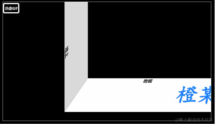
效果:

基础操作哈,注意一下 perspective 与 perspective-origin 属性即可。
接下来,创建投影并加上移动的动画:
css
.floor::after,
.wall::after {
  content: '橙某人';
  font-family: cursive;
  font-weight: bold;
  font-size: 70px;
  white-space: nowrap;
  color: #1e80ff;
  position: absolute;
  top: 22px;
  animation: move 8s linear infinite;
}
.floor::after {
  left: 500px;
}
.wall::after {
  left: 400px;
  animation-delay: 3.2s;
}
@keyframes move {
  from {
    left: 500px;
  }
  to {
    left: -500px;
  }
}
搞定?,效果:
很简单吧。?
但这里其实还有一个问题,或者说是一个优化❗就是"延迟时间(animation-delay: 3.2s;)"。
这个延迟时间不好计算与推断,它受动画时长(animation-duration)、投影大小、移动距离等因素影响,所以只能是粗略估算?。
小编尝试过用 JS 来解决这个问题,但都不尽人意,作罢。如果你有好的解决方案,欢迎评论留言指导,感谢感谢。?
过楼梯
过楼梯其实是上墙壁一个变种而已,多个墙壁的过程就组成了楼梯。
一样,先整把楼梯整出来:
html
<!DOCTYPE html>
<html>
<head>
  <style>
    body{
      width: 100%;
      height: 100vh;
      background-color: #000;
      margin: 0;
      padding: 0;
      display: flex;
      justify-content: center;
      align-items: center;
    }
    .box {
      width: 700px;
      height: 400px;
      border: 1px solid #fff;
      perspective: 800px;
      perspective-origin: 150% -150%;
      overflow: hidden;
    }
    .step {
      position: absolute;
      overflow: hidden;
      border: solid #aaa;
      border-width: 1px 0;
    }
    .step-1, .step-3, .step-5, .step-7 {
      width: 80px;
      height: 120px;
      background-color: #fff;
      transform: rotateX(90deg);
    }
    .step-2, .step-4, .step-6 {
      width: 40px;
      height: 120px;
      background-color: #d8d8d8;
      transform: rotateX(90deg) rotateY(90deg);
    }
    .step-1 {
      width: 320px;
      top: 200px;
      left: 460px;
    }
    .step-2 {
      top: 180px;
      left: 440px;
    }
    .step-3 {
      top: 160px;
      left: 380px;
    }
    .step-4 {
      top: 140px;
      left: 360px;
    }
    .step-5 {
      top: 120px;
      left: 300px;
    }
    .step-6 {
      top: 100px;
      left: 280px;
    }
    .step-7 {
      width: 400px;
      top: 80px;
      left: -100px;
    }
  </style>
</head>
<body>
  <div class="box">
    <div class="step step-1"></div>
    <div class="step step-2"></div>
    <div class="step step-3"></div>
    <div class="step step-4"></div>
    <div class="step step-5"></div>
    <div class="step step-6"></div>
    <div class="step step-7"></div>
  </div>
</body>
</html>
效果:

继续创建投影,只是这次要创建很多投影了。
css
.step::after {
  content: '橙某人';
  font-family: cursive;
  font-weight: bold;
  font-size: 70px;
  white-space: nowrap;
  color: #1e80ff;
  position: absolute;
  top: 22px;
  left: 400px;
  animation: move 12s infinite linear;
}
@keyframes move {
  from {
    left: 400px;
  }
  to {
    left: -800px;
  }
}
.step-2::after {
  animation-delay: 0.4s;
}
.step-3::after {
  animation-delay: 1.2s;
}
.step-4::after {
  animation-delay: 1.6s;
}
.step-5::after {
  animation-delay: 2.4s;
}
.step-6::after {
  animation-delay: 2.8s;
}
.step-7::after {
  animation-delay: 6.8s;
}
效果:

还有一样的问题,这个 animation-delay 延迟时间估算要麻烦一点?。
至此,本篇文章就写完啦,撒花撒花。
评论